
In case you haven’t noticed, we’ve got a logo!

And a tag line:
Ephemeral thoughts of periodic value from the bike lane
We created the logo because … ya’ kinda need a logo for an endeavor this big! Plus, we plan to hand out business cards during our adventure as an easy way for the folks we meet along our journey to find our blog and, we hope, join us in our cause.

Creating the logo was an interesting project that happened over about a week. We used 99Designs to create an online contest. We briefly described what we’re up to (retire, get rid of most of our possessions, get on a bike and ride across the US to raise donations to support brain cancer research) and we included the image on the left and our tag line. I purposely only spent a few minutes on the concept logo because I really didn’t really know what I wanted other than something with a bike in it, and I wanted the designers to have pretty free rein.
Once I’d entered the blurb and uploaded the image, the site then showed me a bunch of sample logos and asked me to select logos I liked as a way to help designers understand the style of logo we were looking for. And I did the same thing with a set of color palettes. Given the submissions, I apparently really like green and blue! (But not as much as the designers think I do.)
Within a few hours after I initiated the contest free-lance designers started submitting designs. New designs trickled in over the course of the week-long contest. Ultimately, we had a huge number of designs (many designers submitting numerous revisions in response to my comments).
The first set of images shows the progression that the winning designer went through. His first ones were not very promising and I was planning to discount his work altogether. But it was cool to see how much his designs evolved based on feedback we provided specifically to him or more publicly to all the designers. Once we were relatively far along in the contest, we asked two very talented and visually astute friends of our, Andy & Debbie Cargile (long-time close friends and authors of Intentionally Off Path) to make some recommendations. I’m sure that we would have ended up with an even better logo if we’d asked their advice earlier on in the process, but I’m happy with the logo we ended up with.
We had 14 different designers participate over the one week contest. Surprisingly, most of them were from Indonesia. I’m sure it’s completely coincidental that we’d spent two weeks there just a month before. But it was a bit unnerving.
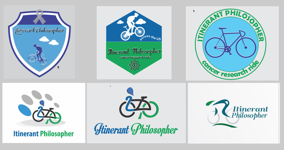
Here is a mashup of the submitted designs. As you can see, some of them were intriguing. Some were, I hope, “not their best work”. And a few had me wondering if they’d ever seen anyone on a bike – or at least someone who wasn’t about to keel over while riding a bike. I also suspect some of them just riffed off each other, including using bicycle wheels as “o”s. My favorite, “Um, no” submission is on the bottom row, second-from-the-left. While it’s an accurate depiction of how we sometimes feel at the end of a long ride, it’s not an image we want to celebrate in a logo. Click on the image to zoom in.
